SavR Recipe App Redesign
Recipe and Cooking
Summary: A redesign of the SavR recipw app's cooking flow, reducing user drop off during active cooking by introducing step-by-step video directions and a cleaner instruction hierarchy.
My role: Solo project. I completed end-to-end research, design, and usability testing.
Problem
Home cooks who want to try new recipes often struggle to find, follow, and revisit meals in a single, cohesive experience. Existing recipe apps are cluttered with ads, require too many taps to reach useful content, and provide little support once cooking actually begins.
Solution
The updated SavR app seeks to create a better cooking experience. From browsing and discovering recipes by category, to preparing ingredients, following step-by-step directions with visual and video support, and saving favorites to return to later. The process used is a modified Google Ventures design sprint created to rapidly map, plan and test ideas within 5 days.
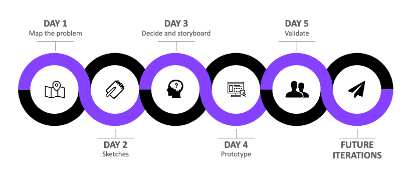
Day 1 - Map the problem
Insights
Users like to follow new recipes with the intention of learning how to cook new dishes and learning new cooking techniques. They would like to be able to easily follow recipes and have the dishes come out as expected. Currently, users cannot tell if they are on the right track when they are preparing a recipe, especially with more complex recipes. There is no way to tell if they are making a mistake at each stage and what is to be expected. There is also an interest in being time efficient, and being able to best manage time while cooking. Users would also prefer not to have to refer back to their phone for every step of the process.
Map
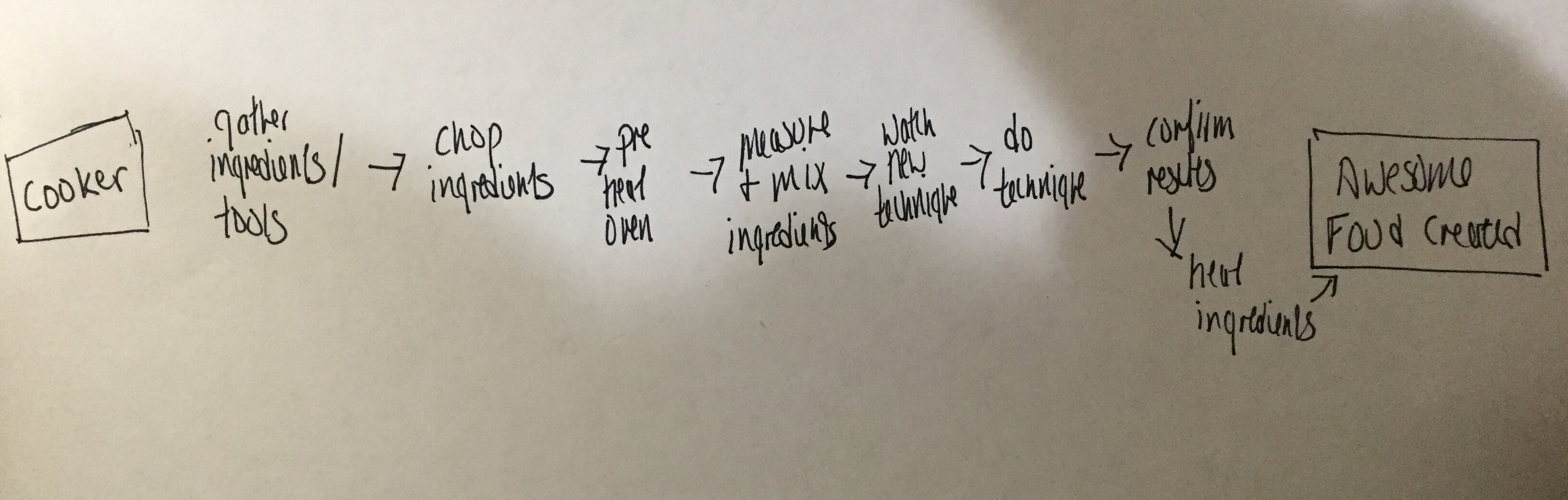
I began by creating a map to represent the process that the customer would use to create a recipe while they were interacting with the app.
Day 2 - Sketches
Exploring Recipe Apps
From exploring recipe apps, I discovered that many of them have similar features that are helpful during cooking. The ability to create a shopping list, videos showing the technique, ingredients listed separate from directions and step by step instructions among other things. Some even have unique features, like the ability to order groceries online to be delivered.
Sketches
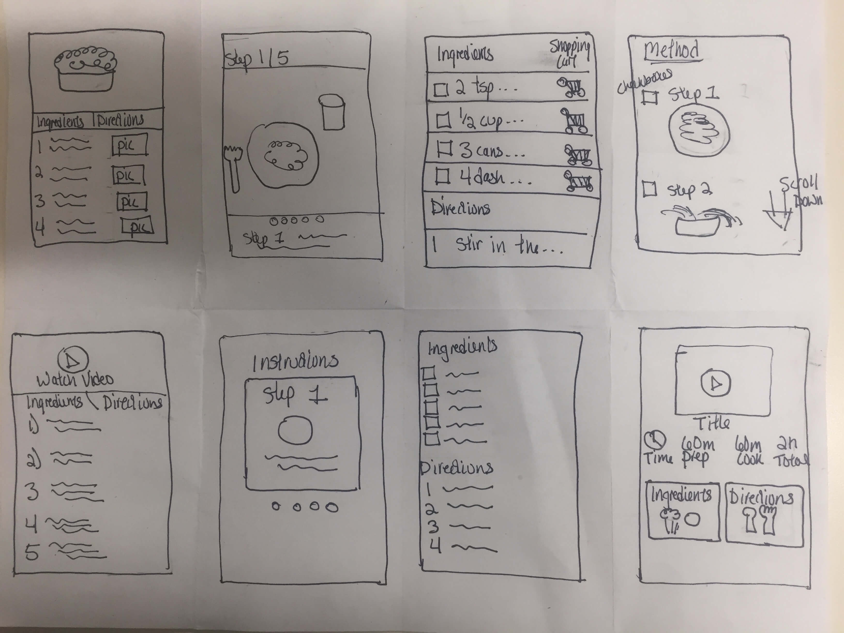
I used a process called the Crazy 8 Screen Sketches to sketch ideas for the most critical screen of the app. From this activity, I decided that the recipe instructions screen was the most critical as it is where users reported the most issues. This is where it is important that users are able to follow the recipe in a simple manner and see a visual comparison to what the recipe should look like.
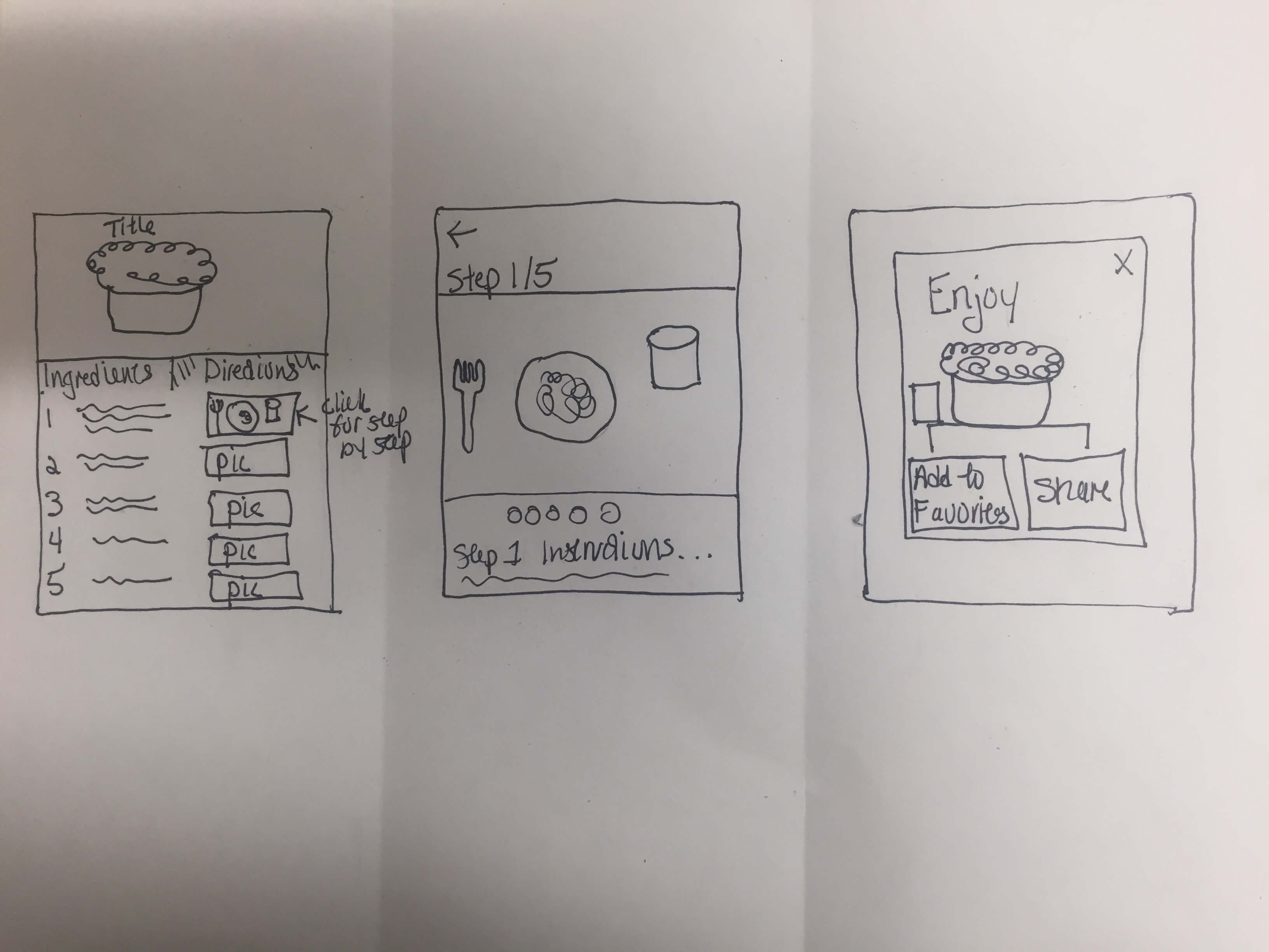
From there, I created a 3 panel screen that included the solution sketch in the middle and the screens that would come before and after this sketch. Users would have the option to view the recipe as a list with small pictures, or to click through each individual step to get a detailed video of that particular step.
Day 3 - Decide and Storyboard
Users reported that they often get lost in recipes and get stuck when they don’t know how to do a requested cooking technique. I prioritized the step-by-step video format over a simple text list because user interviews surfaced anxiety around technique, not just ingredient recall.
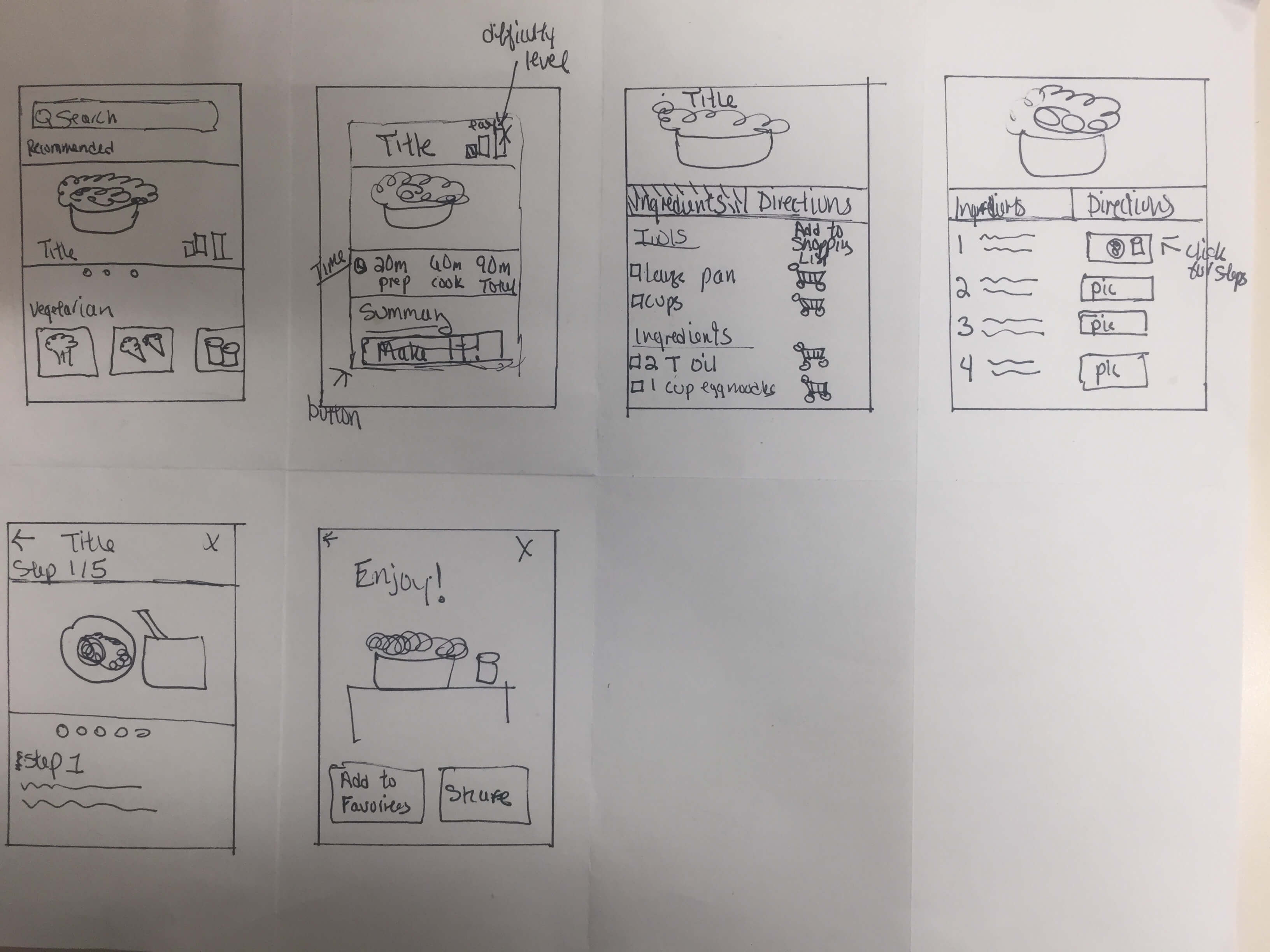
During this process, the user begins by clicking on a recipe from the home screen. From there, they get to a summary screen, where they can read a summary and decide whether to make it or go back to the homescreen. If they choose to make it, they are taken to ingredients, then directions with option to click on a picture in order to see a clear step-by-step method of viewing the directions. Finally, they have a picture at the end to compare their own food.
Day 4 - Prototype
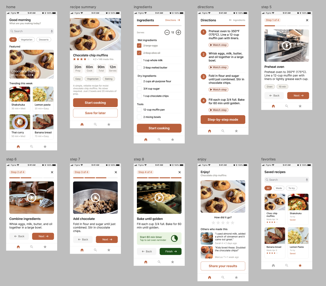
Based off of the sketches from yesterday, I created a Sketch prototype of the new Savr Recipe screens. The goal for testing the prototype is to determine if the main red route is understandable and can easily be followed by users. I also hope to learn what else people believe should be included in the cooking app.
For the prototype, I added more screens to the step-by-step directions to simulate going through the actual recipe. I chose a light peach background and color scheme because I wanted to approach the appetite stimulating color effects of red, but with less of the intensity so that the reds don’t venture into becoming warning colors.
Day 5 - Validate
Moderated usability testing was conducted with five participants recruited from friends and family. All participants cooked at least once a week, regularly followed new recipes, and were comfortable using smartphones. Testing was in-person and moderated, with the primary goals of uncovering usability problems in the core flow, confirming that users understood the step-by-step process, and identifying any gaps in what the app offered.
Results from testing
What worked:
- Simple Design. Testers appreciated how directly the app surfaced what they needed. "I didn't have to hunt around. Everything I needed was just right there when I needed it." Other recipe apps came up repeatedly as a point of comparison, with participants noting that SavR avoided the ad-heavy, over-tapped experiences they were used to.
- Categories.Participants consistently called out the category browsing as a strength. "I cook vegetarian a few times a week, so having that right on the home screen would actually save me a lot of time." The browse structure made discovery feel natural rather than search-dependent.
- Visual Design. The warm color palette and clean layout read as intentional and appetizing. "It doesn't look clinical like some of the other ones. It actually looks appetizing." Several participants said they would feel comfortable leaving it open on a counter while cooking.
Issues and how they were addressed:
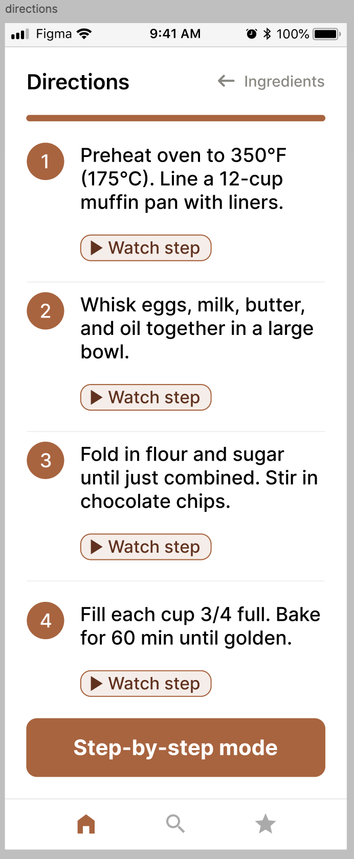
- Confusion at the step-by-step entry point. A clear pattern emerged. Users weren't sure how to get from the directions list into the step-by-step video mode. The small thumbnail images beside each direction step looked decorative rather than interactive, and the instruction to "click for step-by-step" wasn't landing. "I wasn't sure if I was supposed to tap the picture or if it was just there to show me what it should look like." In the revised mocks, this was addressed by replacing the ambiguous thumbnails with an explicit "Watch step" button on every direction row, and adding a dedicated "Step-by-step mode" primary button at the bottom of the directions screen. The affordance is now stated, not implied.
- Need for tips and photos from other people. Participants expressed that seeing other people's results made them more confident trying a recipe. "I'd feel so much better if I could see that someone else made this and it actually turned out right." This feedback directly shaped the redesigned Enjoy screen, which now surfaces a community section showing notes and photos from others who made the same dish — turning what was previously a dead-end confirmation screen into a genuinely useful moment at the end of the cooking flow.
- Tab switching mid-cook. Moving back and forth between the Ingredients and Directions tabs while actively cooking created unnecessary friction. This was resolved in the updated design by grouping the serving size scaler on the ingredients screen and ensuring the directions view was self-contained. This reduced the need to navigate back and forth once cooking began.
Reflections
This project reinforced something that's easy to underestimate at the start of a design process: users will tell you exactly what's wrong if you watch them closely enough. The two biggest issues from testing included the invisible entry point into step-by-step mode, and the desire for social proof from other home cooks. Items that I did not anticipate. The first felt like a solved problem in the prototype. The second wasn't even on my radar as a feature worth including.
Going back to the designs after testing and working through those specific failure points made the final screens substantially stronger. The "Watch step" button is the difference between a feature that gets used and one that gets missed entirely. And the community section on the Enjoy screen reframes the whole end of the flow from a passive confirmation into something that actually helps users feel ready to try the recipe again or attempt something harder next time.
If I were to continue developing SavR further, the two areas I'd focus on next are a serving size scaler that dynamically adjusts ingredient quantities inline, and a smarter home screen that learns from what a user has saved and cooked before. Both would deepen the usefulness of the app beyond a single session, which is ultimately where a recipe app earns long-term retention.