Smith Farms
Small Local Business
Summary: An e-commerce website for Smith Farms, a small local egg farm with an established customer base that relied entirely on in-person, cash-based sales. When face-to-face transactions were no longer possible, the business needed a way to continue selling to existing customers and accepting new ones. This project designed the full purchase experience: from landing page through product selection, delivery verification, checkout, and order confirmation.
My role: Solo project: owner interviews, user flow mapping, sketching, prototyping in Figma, and remote usability testing with existing farm customers.
Problem
Smith Farms had a loyal, long-standing customer base who bought eggs directly from the farm, paying cash in person. When that model was no longer viable, the business had no way to accept orders, collect payment, or coordinate delivery.
Solution
The solution was to esign a simple, trustworthy e-commerce experience for an audience that ranged in technical comfort and were accustomed to a personal, relationship-based transaction.
Map the problem
Key Insights
- Existing customers were highly motivated. They already trusted the product, they just needed a way to order it
- The zip verification step needed to happen early, before a user invested time filling out a cart, to prevent frustration
- The owner needed a simple, low-maintenance system. Nothing that required ongoing technical management
User Map
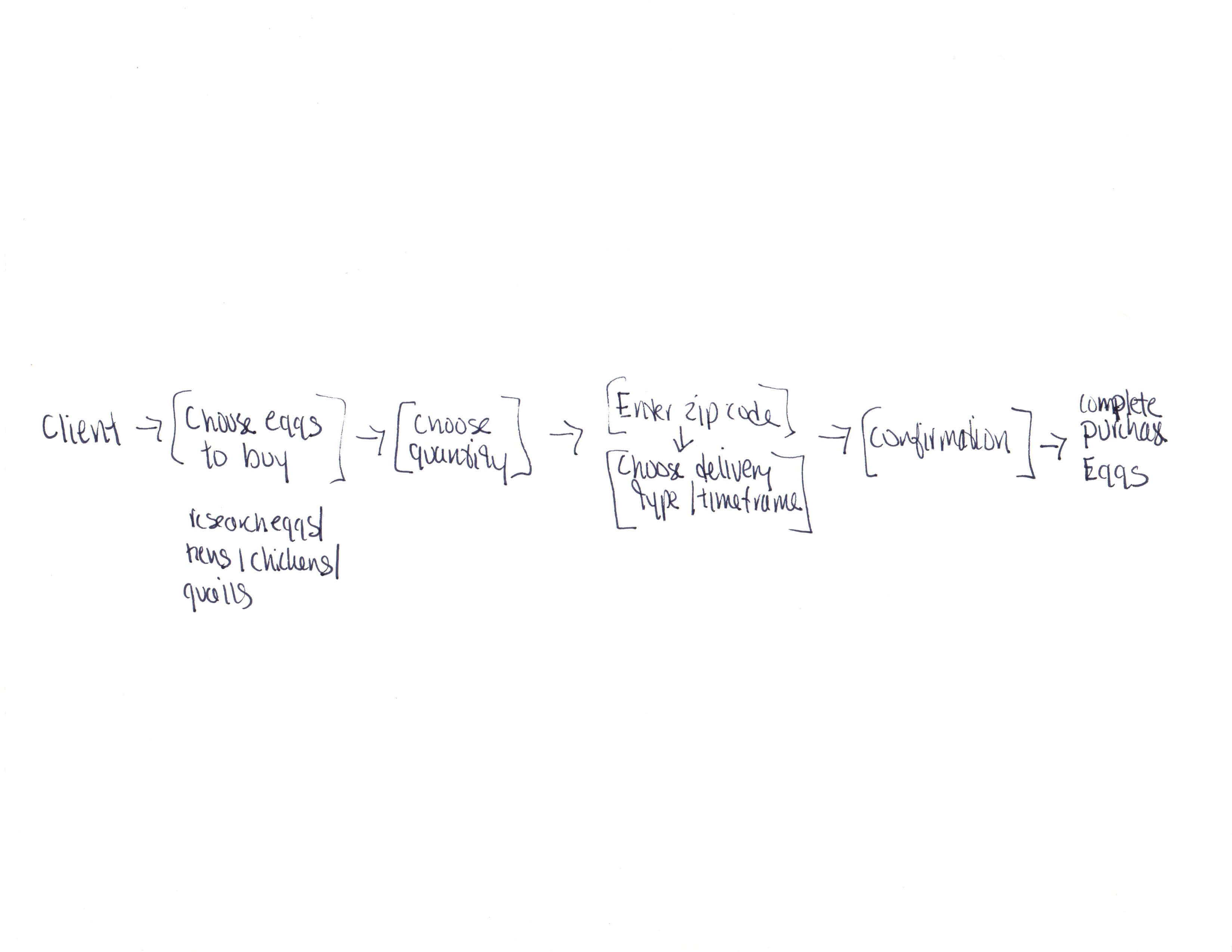
Working directly with the farm owner, I mapped the ideal customer journey from discovering the website through completing a purchase. Two constraints shaped the entire flow from the start: delivery was only available within a small set of local zip codes, and the product catalog was intentionally small (primarily chicken and quail eggs). These constraints were features, not limitations. A focused product page and an early zip code check meant users would know immediately whether the service was available to them, avoiding abandoned carts from out-of-range customers.
Sketches
Preliminary Sketches
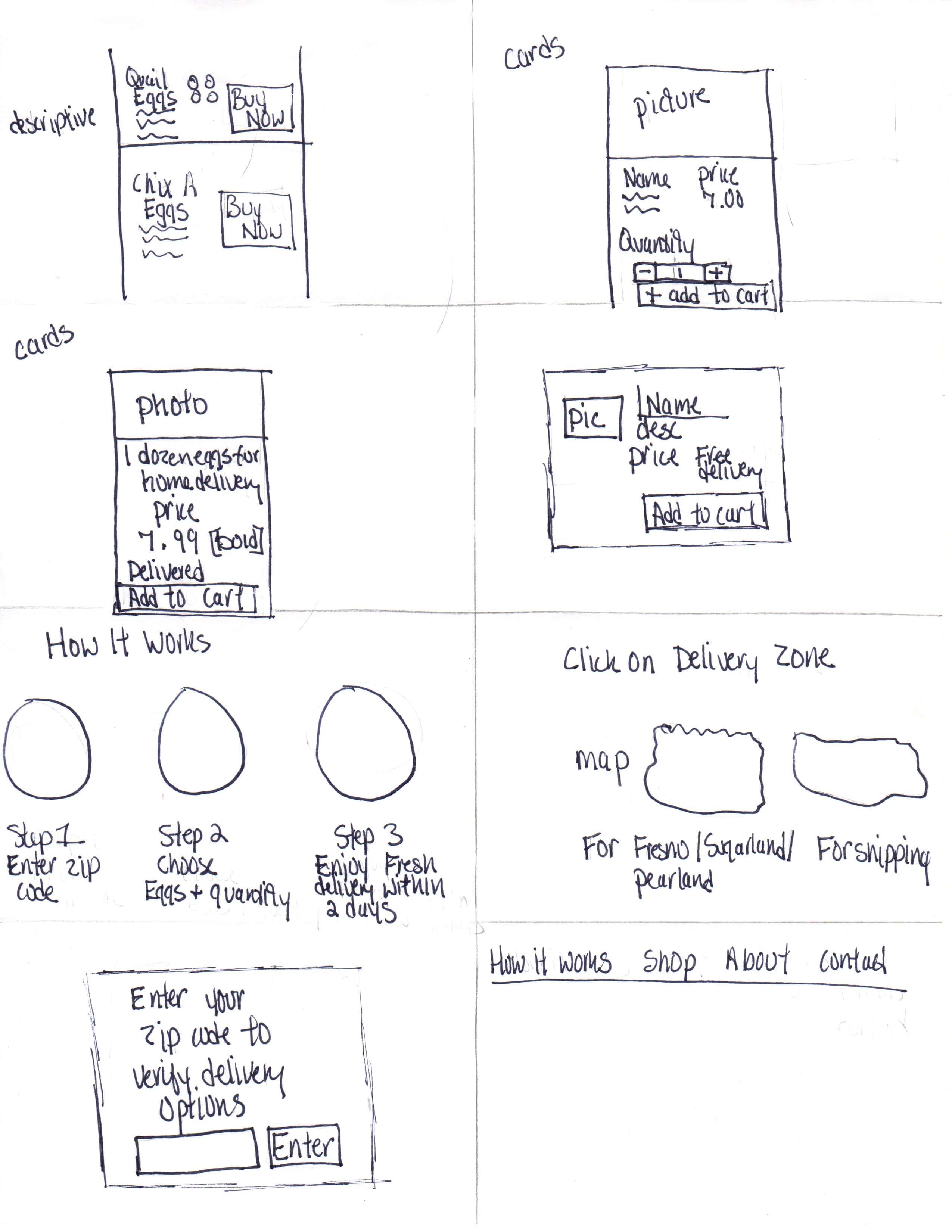
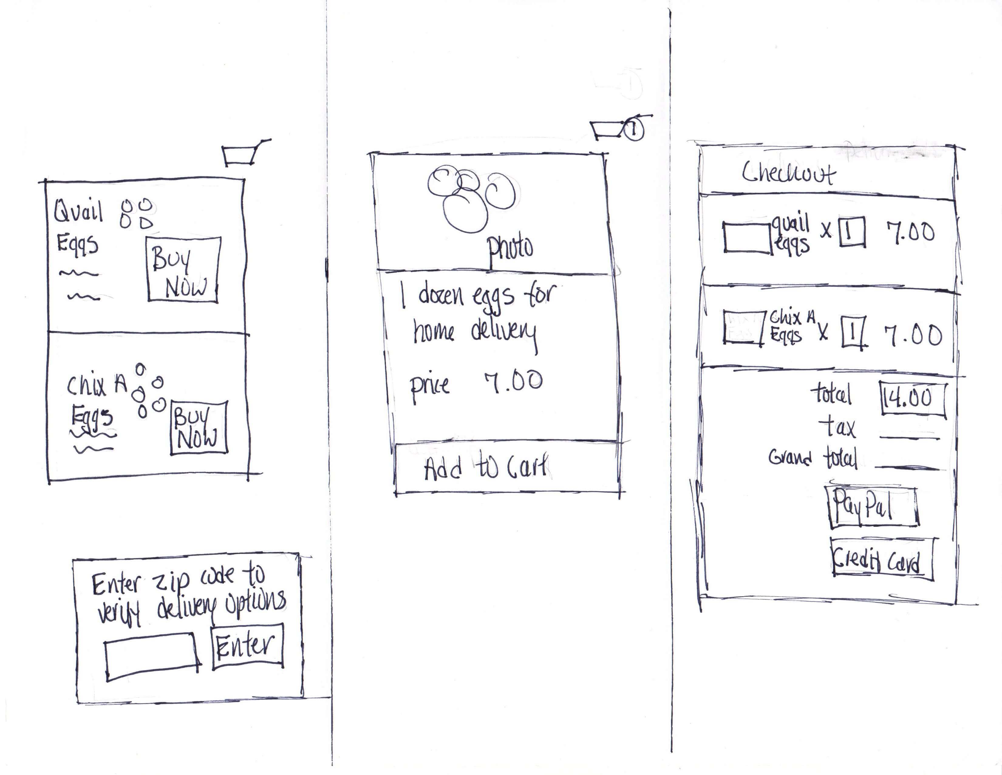
The owner identified the product page as the most critical screen. From preliminary sketches, two directions emerged for how to handle the delivery limitation. The first introduced a zip code verification modal triggered when a user attempted to add an item to their cart. The second placed the zip check earlier, on the homepage, as a gate before showing products at all.
The cart-trigger approach was chosen because it preserved the browsability of the product page. Users could still see what was available and become interested before being asked to verify eligibility. A note below the zip field made the delivery areas transparent from the start.
Decide and Storyboard
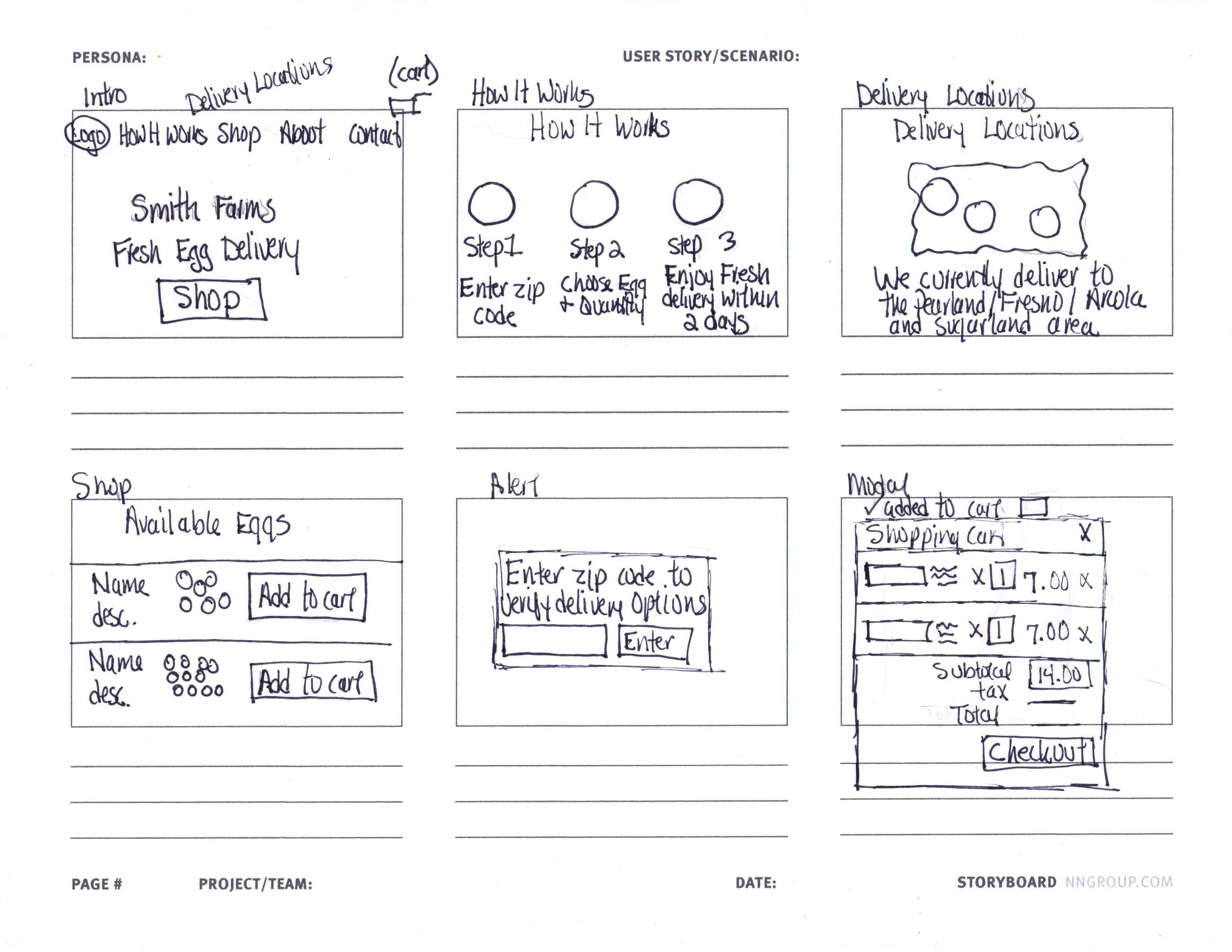
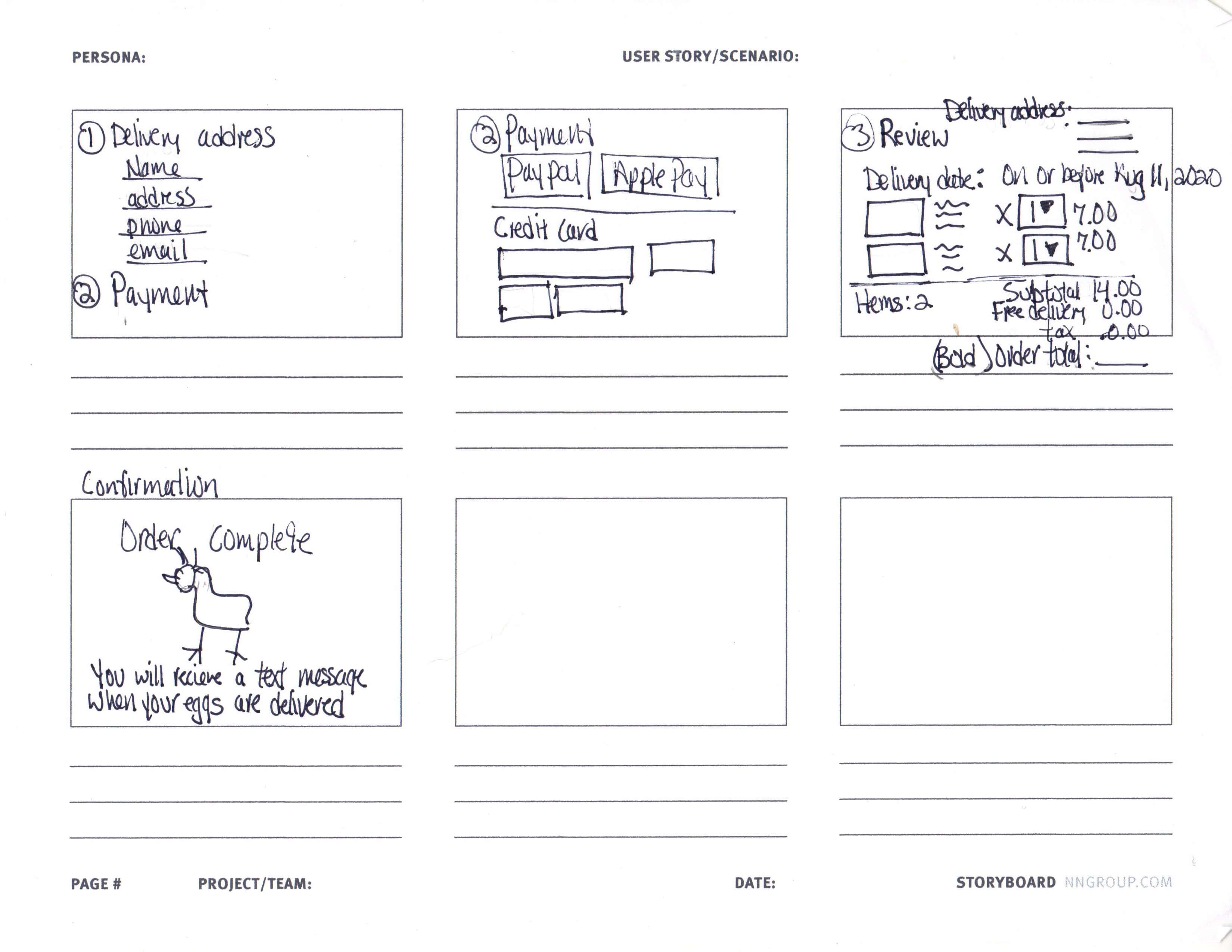
The owner and I aligned on focusing the prototype on the post-zip-confirmation flow. The path a verified local customer would take from the product page through to order confirmation. The desktop version was prioritized first, with mobile to follow.
The storyboard covered: landing page → shop → zip verification modal → add to cart → shopping cart → delivery address → payment → review → confirmation.
Prototype
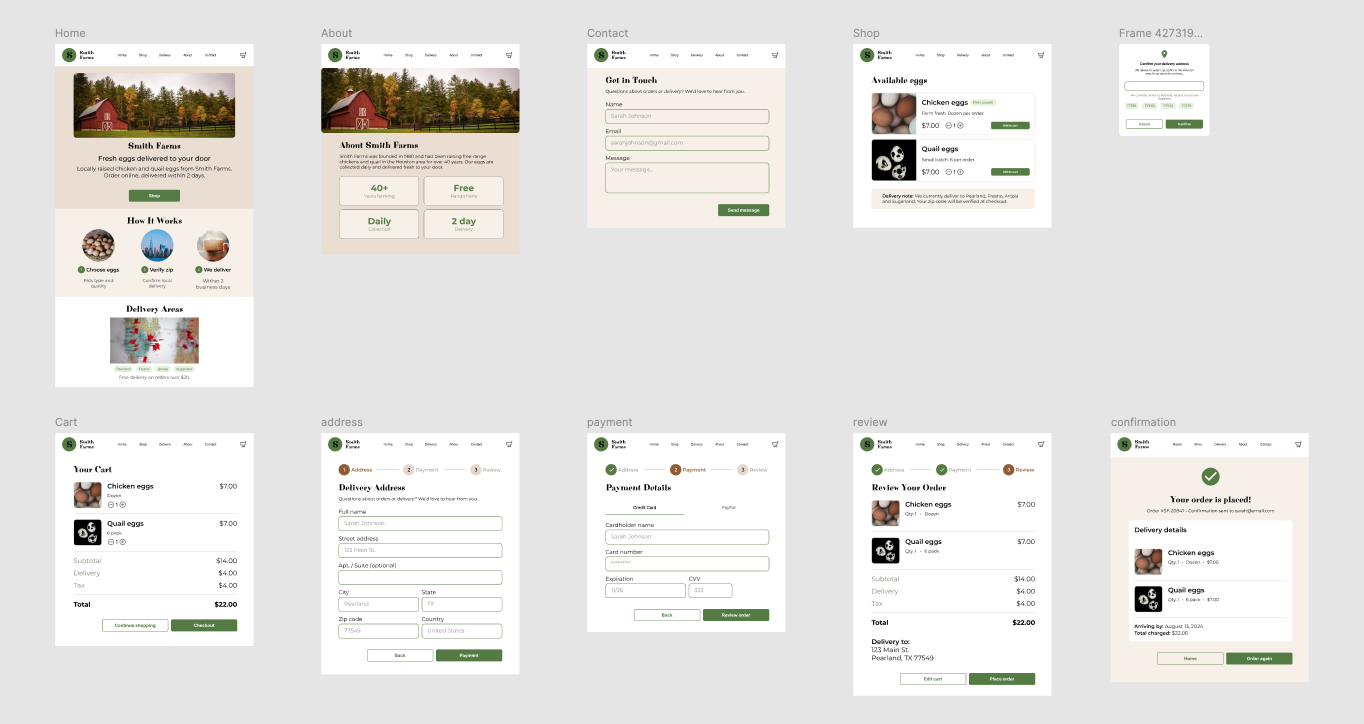
A Figma prototype was built covering all screens in the primary purchase flow, plus the informational pages (How It Works, Delivery Locations, About, Contact) that would help new customers trust the site before purchasing. The color palette was drawn from Smith Farms' existing egg carton packaging (warm tans, sage green, and off-white) to create immediate brand continuity for customers who already knew the product.
User Testing
The prototype was tested remotely with five participants: a mix of existing Smith Farms customers and personal contacts. The primary goals were to confirm that the purchase flow was completable without instruction and that the zip verification step didn't cause confusion or drop-off.
Results from testing
What worked:
- End-to-end flow.All five participants completed the purchase without getting stuck. "I liked how straightforward it was. I knew exactly what to do at each step." The reduced number of decisions at each screen kept momentum through the checkout.
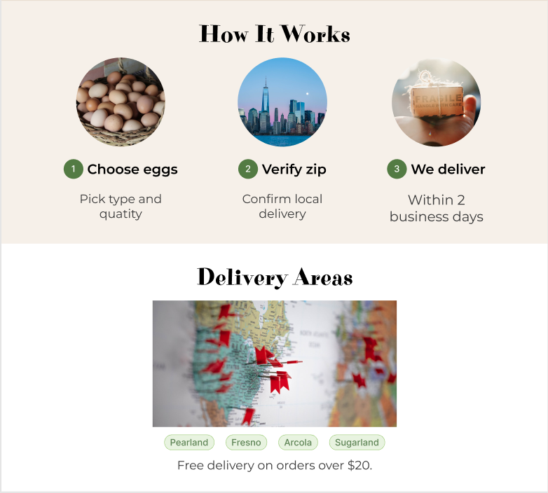
- Instruction clarity.The three-step "How It Works" section on the landing page was well-received. Participants felt oriented before they even reached the shop page, which reduced uncertainty for less tech-comfortable users.
Issues and how they were addressed:
- Pick-Up Option. Several participants mentioned that they often preferred to pick up eggs directly from the farm rather than wait for delivery. They wanted a way to place an order online and collect it contactless. After discussing with the owner, a future pick-up flow was scoped as a next iteration. The current delivery-only model was kept for launch given operational constraints, but the flow was designed with a pick-up toggle in mind for the next version.
- Sign-in and saved information Multiple participants asked whether they could create an account so they wouldn't have to re-enter their address and payment details on repeat orders. They expected the site to reflect the ongoing relationship they already had with the farm. A saved-account feature was added to the future iterations list as a high-priority next step.
- Loyalty program A few participants mentioned interest in a loyalty or rewards program. While not feasible for the initial launch, this feedback aligned with the broader insight about returning customers.
Reflections
This project was a reminder that constraints can actually make for cleaner, more focused design. Every screen had a clear single purpose, and the zip verification step was a good example of designing around a real operational limitation rather than ignoring it.
The most valuable finding from testing was the sign-in request. I had assumed that simplicity meant fewer steps and no account creation, but users told me that saving their information wasn't added complexity, it was expected convenience. For a customer base built on familiarity and trust, the online experience needs to earn that same sense of ongoing relationship over time.